Visual identity
Brandbook
Our brandbook outlines the visual elements of FinEst Centre's brand identity. It provides guidelines on logo usage, colors, typography, imagery and other elements to ensure consistent and cohesive brand representation across platforms and media.

Logos
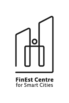
We prioritize human-centric urban innovation and growth, reflected in our logo symbolizing ascending buildings and an abstract human form. Decision-making involves individuals embodying the evolving city. The continuous line in the logo signifies the interconnected relationship between people and cities, representing to the ongoing work required for development.


Colors
color square
Main green
hex
rgb
rgb
#1AB690
26,182,144
26,182,144
color square
Main blue
hex
rgb
rgb
#7B8BDE
123,139,222
123,139,222
color square
Main purple
hex
rgb
rgb
#A78EED
167,142,237
167,142,237
color square
Gray
hex
rgb
rgb
#2D2D2D
45,45,45
45,45,45
color square
Dark green
hex
rgb
rgb
#244F45
36,79,69
36,79,69
color square
Dark blue
hex
rgb
rgb
#3F5099
63,80,153
63,80,153
color square
Dark purple
hex
rgb
rgb
#6B52A8
107,82,168
107,82,168
color square
Black
hex
rgb
rgb
#000000
0,0,0
0,0,0